Friday, 9 March 2012

Exterior Packaging

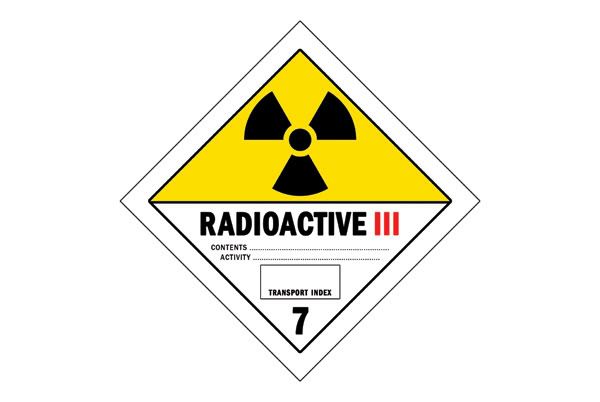
This isn't so much a prop as it's a genuine hazard label. Luckily enough theirs lots of info about these on the net so it was easy to replicate and scale down to 65mm2 to meet the requirements of the case.

Class 7 - Radioactive
Radioactive materials are divided into three divisions, each with its own unique hazard class label.

Hazard Class 7 Radioactive I White Label - Low level radioactive materials require a white label with the radioactive trefoil at the top and words including "Radioactive I" on the label. (W40-601R)

Hazard Class 7 Radioactive II White/Yellow Halved Label - Moderately radioactive materials require a 1/2 white 1/2 yellow label with the radioactive trefoil at the top and words including "Radioactive II" on the label. (W40-602R)

Hazard Class 7 Radioactive III White/Yellow Halved Label - Highly radioactive materials require a 1/2 white 1/2 yellow label with the radioactive trefoil at the top and words including "Radioactive III" and a Transport Index on the label. (W40-603R)

Here's what I came up with:
Photobucket

And just a quick teaser for now as it's pitch black now so I'll get some better images tomorrow. Stick need to create the "Plutonium Handle With Care" lettering viynl cut. I'll size this off and get it sent off externally as I still don't think theirs any material down in digital print.

Photobucket

Packaging as Props Updates

As promised in previous posts, I was talking about some recent packaging developments that I'd show in a day or two. Well that day is today because look what rocked up this morning!
Photobucket

Photobucket

Photobucket

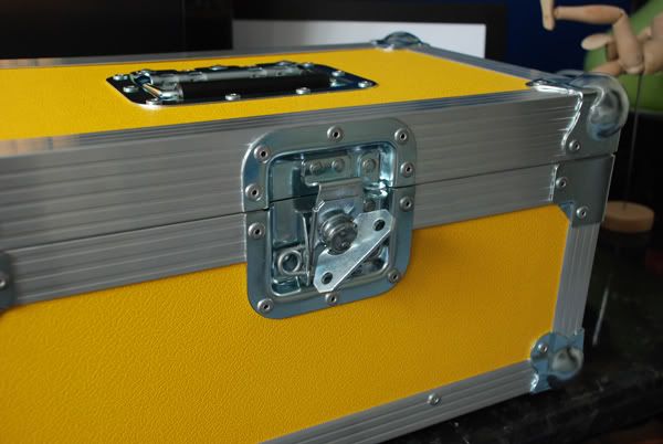
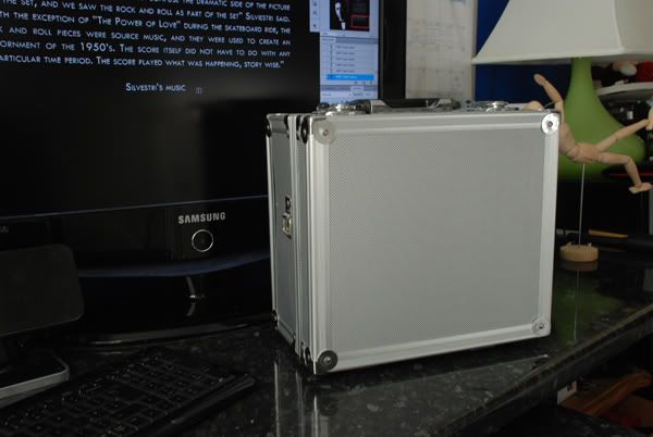
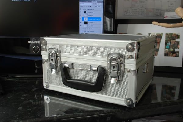
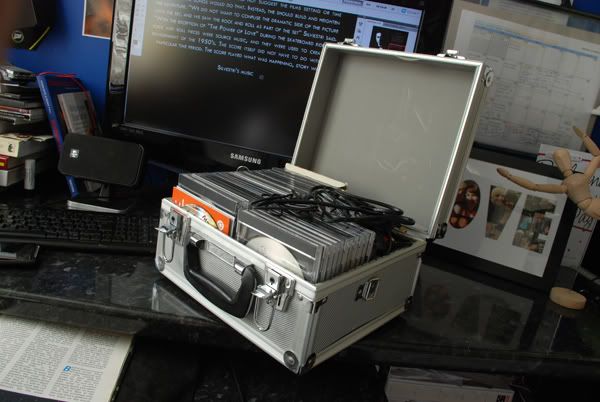
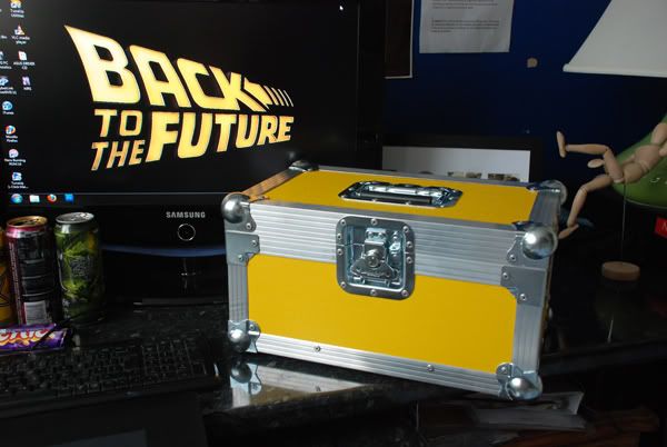
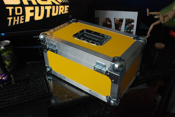
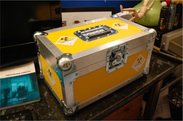
This is a aluminium flight case by Swan Flight and was origionally intended to hold 7 inch vinyls. A little more information about the case below:

1x Strong butterfly catch on the front with loops for padlock holds the lid in place
2x lift-off hinge at the rear so that the lid removes completely.
1x Dish handle fitted on the top.
Stacking ball corners.
Centre divider 2 rows of 100x 7" singles.
Total capacity 200x 7" singles in paper sleeves.
Fully foam lined with 3mm black plaztazote.
2x Internal sections 230mm(L) x 190mm(W) x 190mm(H).
External 430mm(L) x 270mm(W) x 230mm(H).
Weight approx 4kg.

After doing a little research on the case used in BTTF one, I found the manufacturer who produced the case to be Anvil, a leader then and now in custom ATA certified travel containers. Every single case you can get from Anvil is firstly very expensive and always custome so I was avoiding that option but I was looking at yellow flight cases in general.

The dimensions of this case is just perfect for the intented contents and looks awesome in person. As previously said to re-address the needs of graphic design the product will have a card wrap around sleeve. This was spoke on in greater detail in past posts so if you havent seen it already, please check that out.

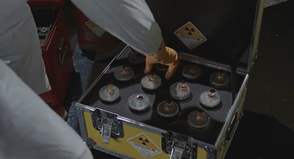
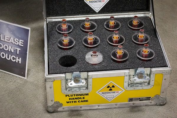
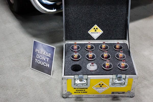
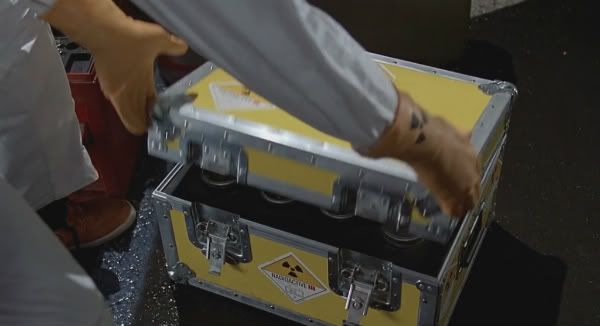
The images below show how close the case is to the movie prop.
Photobucket

Photobucket

Onviously my case is a lot smaller and so it should be, the case used in the movie housed 12" records so it was huge and because of this theirs slight differences such as I only have one locking mechanism. Although if you do compare you'll see how similar these cases are in design and in terms of locks Swan were one in an extrememly small number of manufacturers to be using the butterfly catch, the exact same lock used in BTTF. As a whole, seeing this has given a well need motivational boost to push on.

In terms of the next steps for the case, I'll be looking into filling the interior with charcoal foam and testing layouts for where each of the products will sit withing the carrier. I'll also be looking into dressing the exterior with the radioactive info labels.
Thursday, 8 March 2012

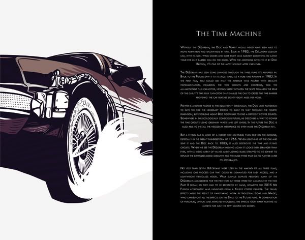
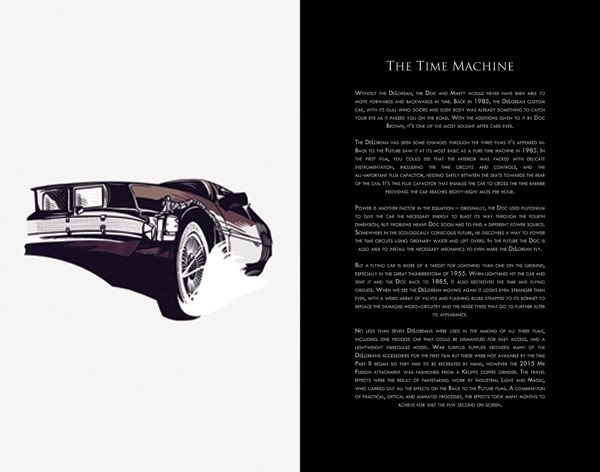
Painting - Time Machine Feature Page ...

No video for this one I'm affraid. Took quite a while to get right this one and I'm still not 100% on it but hey, deadlines an everything so must move on. Final painting to be completed tomorrow, well, today is Alan Silvestri's portrait. Not really looking forward to it but it marks the end of these larger images which means I can start working on the comic, which will be in a much more looser style and hopefully shouldnt take more than 10 days to complete (thats the plan anyway).

Photobucket

Photobucket

Two Mock-ups for this one just to show how it could look on a larger scale. Is this more effective? Something that I'll have to get some opinions on. Not the greatest of posts but then again it is 5 in the morning an I'm feeling pretty vegetably. Its my birthday today :D

Photobucket


Photobucket

Wednesday, 7 March 2012

Props In General

Since we're talking about props I thought it would be a good idea to discuss what will be included within the case. Obviously I have the Art Book but I also wanted to replicate some of the movie props and included them for the pack.

Been checking this site for a while now - http://www.yourprops.com/view_items.php?movie=Back+To+The+Future&index_from=150

Your props.com basically lists off every single prop from the whole trilogy.

I think it's quite important as a trilogy to included a prop from each film that's been key to the story or summarised an experience. The story itself is more about the relationship between Marty and Doc than anything else; the time machine is simply the go between that connects there relationships. Because of this I want that idea to be reflected in the props I'll choose. The props themselves will be print based that can be replicated by hand.

The chosen props that will be included is the warning letter that Marty sends to Doc in Part I, the Grays Sports Almanac 1950 - 2000 from Part II and the photograph Doc gives to Marty in Part III. The letter is being chosen because of the connection the two have the need for Marty to save his friend. It also was a key point in Doc's characteristic that he chose to keep and read the letter he himself once said would jeopardise the fabrics of the space time continuum. It was when we saw a less serious side to the Doc. Sports Almanac is what drove the whole film in part two. It was because of this getting out in the 50's that rewrote time and kicked off the adventure of the film. The final prop was chosen because this was when the connection between Marty and Doc was broken when they were separated in time during the end of Part III. Doc travels back to 85' to hand Marty the photograph of them both and signs it "My friend in time, Marty". A real nice piece that concludes the film and their friendship. Something that a collector would appreciate anyway.

Tuesday, 6 March 2012

Packaging as Props

Just to let my cripple hand heal up a bit I thought I'd stray away from the Wacom and get back to documenting my ideas for the packaging. The decisions I'm talking about have already been thought through and made previously, but as I've been late on documenting everything, this is more of a catch up.

So as I was discussing in much late posts I want the outer packaging to be more than something that justs holds some discs and a book. I want the packaging to be more functional and more relevant as a film collector item which is why I want to incorporate the idea of a prop. On watching through the film I was one or two ideas that may have been appropriat however nothing else was more apropraite than Doc's Plutonium case from the first movie. It seems perfect in a way as it's really an extension from the time machine itself and it's whats required to create the energy which then feeds back into the idea of how essential it is to the film.

Photobucket


Photobucket

With this in mind I started looking at numerous ways of how I could start to get this idea off the ground. At first I was liking the idea of recreating the effects in PS and crafting a nice hand made box which was a good idea as I could scale it to the exact dimensions I'd require. Although further into the project I was seeming the vast ammounts of time the illustration work was and still is taking.

Because of this side of things I started to look into other objects and remembered seeing a aluminium case kicking around house.

Photobucket


Photobucket


Photobucket

Cutting out the weeks it would take to test and craft the case oppose to buying one in would be much more logical but it does involve some issues of it's own. Firstly if I was going down this route, it would need to be quite screen accurate as it would if I were to have made my own. Any old ally case won't cut it. But also how is buying in a case graphic design? To solve these issues I managed to get hold an incrediby accurate case which I'll post pictures of as soon as it arrives (hopefully tomorrow or day after) and I'm also looking at a wrap around sleeve for the case. The sleeve will work to wrap around like a belly bar with a cut out on the top for the handle. This actually works a lot better than I could have hoped for because with the sleeve you'd have the titles, information, imagery, barcodes and copy which I didnt want permanently printed to the case anyway. So with this idea this can all be fixed to the sleeve and with the card sleeve removed, your left with a piece of packaging that's clean and looks cool as hell.

Very exciting times anyway. All I can think about right now is the end of year showings and something like this on display will definitly look the part and hopefully attract some wanted attention!

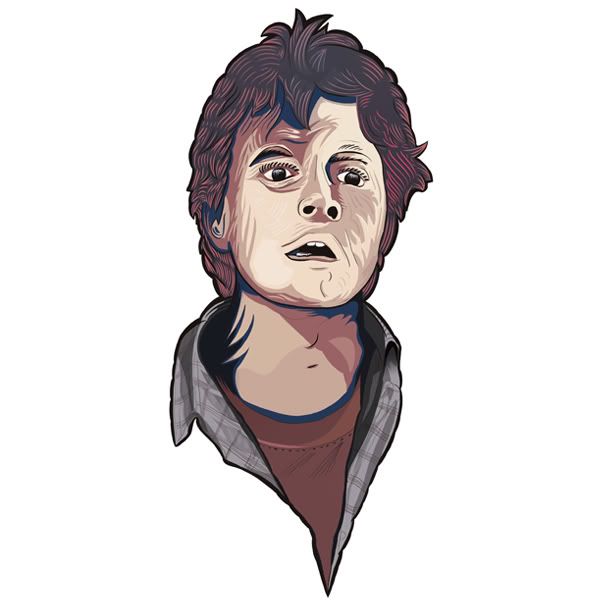
Painting - Marty's Feature Page

As I was saying in the previous post, I was trying to work away from all those little details that don't show on print and get in as much detail as I actually needed rather than detailing for sake of it. Placed the image I'd done previous, of the Doc next to the current painting throughout the process to try an get back to a similar, more basic style. Really refreshing actually to just do the image at a quicker turn around opose to letting it drag on with detailing. And to be honest, the outcome at printable scale will no dount be the same. Anyway enough rambling, I've put pics and video below :)

Photobucket


Photobucket

Process

Monday, 5 March 2012

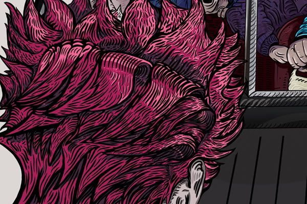
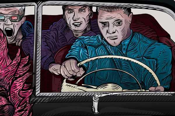
Painting - Biff's Feature Page Colour..

The last of the detailed ones with this. Was painted up with a lot more detail than needed for the book anyway - as none of the detailing will show up at print scale in that format. Was intending to run some prints on posters so if this does get used it will show off some of the minor lines etc.

The image runs with a darker style in comparison to others, however I thought this more fitting to the context of the characters being 'The Bad Guys'. Should work a lot better on a darker backing, as always, I'm just throwing things up on here for now so I'll be going back into everything at a later stage.

A little video as always - skipped out some stuff towards back end because of some errors with the recorder, (..not that I forget to press record or anything :D) and it does run a little fast so sorry if this burns your eyes.


And some close up shots -

Photobucket

Photobucket

Photobucket

Photobucket

Friday, 2 March 2012

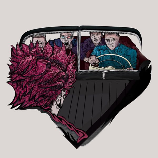
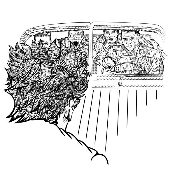
Painting - Biff's Feature Page ...

Just finished inking the black's for Biff's feature page. I figured I'd post the colour seperate as I've recorded the inking process and that's 15minutes long on it's own. Colour's been done now, should be ready in 10hrs time hopefully.


Photobucket


Photobucket

Photobucket

Thursday, 1 March 2012

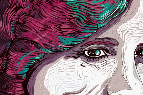
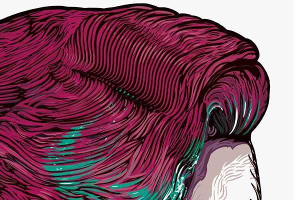
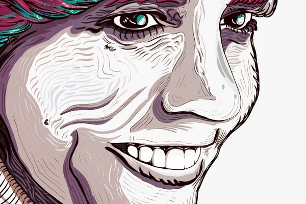
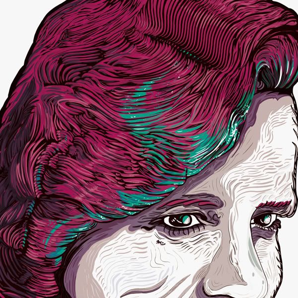
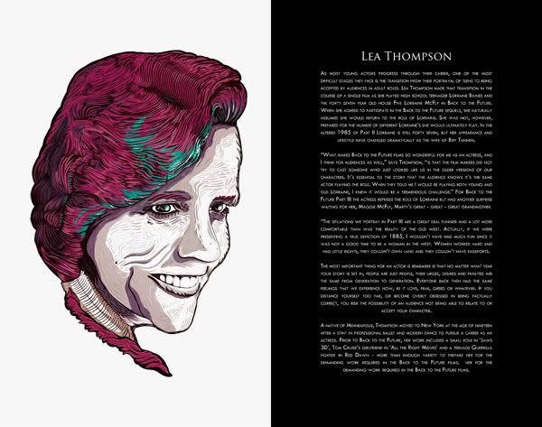
Painting - Lorain's Feature Page ...

Been taking a little more time on this one. Wanted to get in a little futher on the details so it obviously went on a little longer than expected. Roughly 30hrs but I did a 15hr straight run for first leg so it's not like it went on for days.

Photobucket


Photobucket


Photobucket


Photobucket


Photobucket


Photobucket

As promised as well, the video. Unfortunately it is missing two to three large sections so it does jump around a lot. I'd pause it when I went for snacks and then forget to resume recording :D Never mind, shows the basic process anyway which I guess is maybe good for showing development work.

Thought I'd go with some family frienly music for backing track..


As before, I've also very roughly mocked up the page for display only. Nothing final in background colour and/or layouts. Background work to be later painted

Photobucket