Tuesday, 28 February 2012

Painting - Doc's Feature Page ...

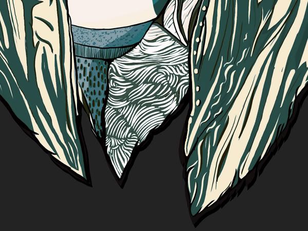
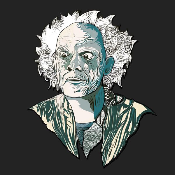
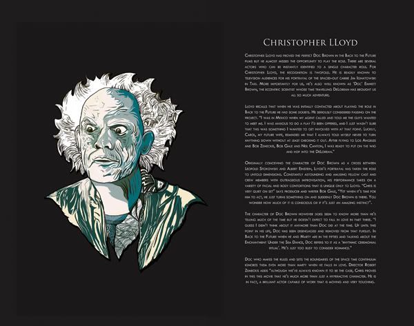
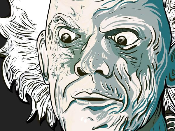
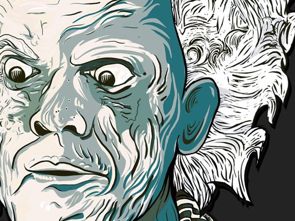
Taken a few images from the steps an that. There's not a lot of images because I wasn't regularly taking screens but you can still see the progress etc. For the next images I'll be using some screen capture software which should be fun. Roughly 13hrs on this one, be doing all the background work for each image at a later stage -


Few close ups incase zooms not too great on Issuu -

Photobucket

Photobucket

Photobucket

Photobucket


And a test mock up - Colours are a mess on this one but its just a quick test to show how it works on the page

Photobucket

Monday, 27 February 2012

Sunday, 26 February 2012

Print

Below is a list of all the possible printers that I’m going to contact for print/binding the art book. The list has been sourced by looking at all the services and forms of print available locally and over the internet. There are tons of places offering book binds but there not all for small runs and require minimum orders of 50-100 and so on. Ideally I’d like to get in touch with Target Print, mainly because it’s local enough to call in, and I’ve seen their work first hand and it was spot on. The concepting for the book is now complete so I’m just compiling the final page count and then I’ll send out emails to all the addresses here.

A4 Hard Back Books at Cypher Digital – Stated at A4 but it also states for custom, get in touch. Dimensions of my art book runs in at 260x330 double page spread so I’m well under A4

http://cypherstore.co.uk/product_info?c_product_id=748

http://printvend.net/product.php?productid=36&_kk=colour%20book%20printing&_kt=c730dced-e58f-421b-b7b9-f93df7d41ff9&gclid=CPDusemPvK4CFQcRfAodkAEqJg

http://www.hartandclough.co.uk/printers/printing.html

http://www.biddles.co.uk/wwd_colour.htm Min run 50

http://www.biddles.co.uk/wwd_colour.htm

http://www.targetprint.co.uk/index.html

http://www.harmerprint.co.uk/

http://www.prontaprint.com/businessservices/Pages/default.aspx

Friday, 24 February 2012

Art Book Copy

Finalised copy for the art book that follows a short introduction to the scene in which the comic is based upon - character profiles and input from the composer Alan Silvestri. Tagged as DC and DP as the text was sourced myself through sources online, books and interviews.

Monday, 20 February 2012

Layout Tests - Second Section of the Art Book

Experimentations with layout for one of the double page spreads. Important step as the layout will be ultimately consistent throughout. Played around with a few ideas before decided that simple ideas were much more effective.

Sunday, 19 February 2012

DC Comics

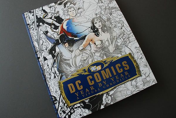
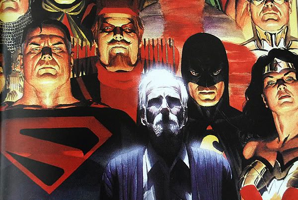
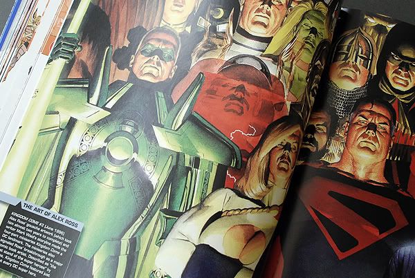
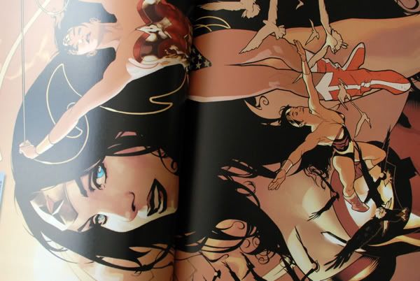
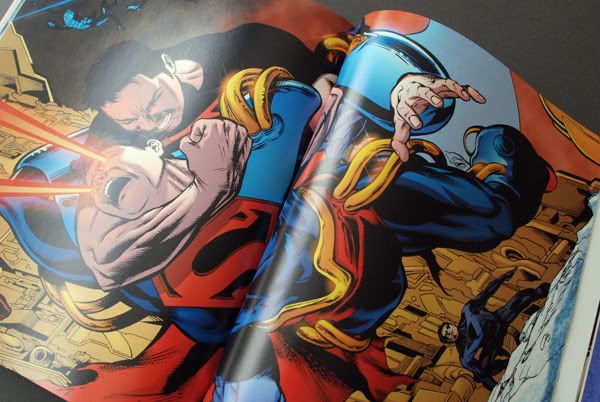
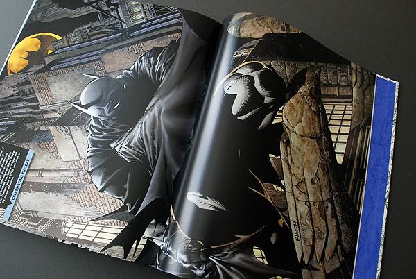
At the same time I also got hold of this for illustrative research. I like the art work but it's thrown up some issues between Marvel and DC for me. My second brief is DC comics and DC shoes caliberation. The issue is that after looking at these books the Marvel character range is amazing, Hulk, Iron Man, X-Men and Cap America. DC's flagships are batman and superman, both of which I think have been done to death on clothing recently with the S shirts etc. Good to note the Avengers release this year and how promotion through DC SHOES could benefit a Marvel film. Titles like MARVEL VS DC for the clothing? We'll see.

Photobucket

Photobucket

Photobucket

Photobucket

Photobucket

Photobucket

Marvel Comics

Picked this up the other day - fantastic book that's highly informative, featuring information on every comic of Marvel to the pudblished date including the artists that created them. Invaluable piece of research right here, few pics below:

Photobucket

Photobucket

Photobucket

Photobucket

Photobucket

Photobucket

Photobucket

Photobucket

Photobucket

Photobucket

Photobucket

Photobucket

Photobucket

Photobucket

Saturday, 18 February 2012

BTTF Logo

Because I can't change the logo itself and why would I?.. I've been looking ways of getting some slight variations of the original. Initially I traced over the existing work by blacking out the colour in PS and running a live trace in AI. This didn't give the cleanest of results in terms of line quality although I'll be aiming to retouch this later. The lines were then placed into C4D so that I could pan around the 3D model to find a nice angle and depth. I was really trying to add a fresher look to a logo from the 1980's without altering the main features.


Final result posted at the end of this bind. Initially I was liking the over the top 3D effect but in context it's not working. For me, a much more subtle effect proved to be more effective.

Friday, 17 February 2012

The Court House Square 1985 (Copy)

The court house square 1985

Marty visits the home of his inventor friend Doctor Emmett brown on his way to school, but the scientist is out. The Doc phones and asks Marty to meet him tonight at 1:15am. After realising the clocks in Doc’s workshop are set 30 minutes back in time, the seventeen-year-old realises he is late and rushes to Hill Valley High School but he’s caught sneaking in the school by the head of discipline, Mr Strickland.

Marty’s band, the Pinheads are due to audition for the school dance but Strickland dismisses their chances by saying “no McFly ever amounted to anything in the history of Hill Valley”. During audition the band is quickly eliminated and the despondent Marty walks his girlfriend Jennifer Parker to the Hill Valley’s Courthouse Square.

Their conversation is interrupted by an insistent woman campaigning to preserve the Courthouse Clock Tower. It was struck by lightning thirty years ago and has never worked since. Marty gives the woman twenty five cents to go away and gets a ‘Save the Clock Tower’ flyer that he keeps with him. Arriving home, he’s in time to his father George being humiliated by supervisor Biff Tannen. As always his father takes the humiliation because he can’t handle confrontation.

At dinner Marty’s mother Lorraine remembers how she met George; her father hit him with the car. She fell in love with the injured teenager and decided to spend the rest of her life with him when they kissed for the first time at the Enchantment Under the Sea Dance.

After midnight Marty meets up with the Doc, a wild eyed man of unknown years. He unveils his latest experiment, a time machine built in a DeLorean. Marty videotapes Doc as he explains how he invented time travel thirty years ago after hitting his head while hanging a clock. Doc came to with a vision of the flux capacitor, which is what makes time travel possible.

The DeLorean needs plutonium to generate the 1.21 jigowatts of electricity needed for time travel. Doc swiped his plutonium from some Libyan terrorists who suddenly turn up seeking vengeance. Doc is brutally gunned down and Marty manages to escape by jumping into the time machine. A fast paced chace forces Marty to travel at 88mph sending him back to 1955.

Rework of the Book Concept

Few little change that I spoke about in the previous post. Also played around with the spacing on the whole thing to make it a little tighter. This section at least is pretty much there now, ready for tracing. Feels almost pointless tracing over art as appose to making my own though. Might not be as motivating during the whole drawing process but as said before, I need to apply my style of illustration to a subject and the art work was already there.


Next step from this will be to continue with the book layout. List to do today will be adding all the copy and working on the revised contents page which is as follows:

The court house square 1985(MARTY’s JOURNEY IN THIS BOOK). Introduction to the movie but also just the type that follows the imagery of the art book.

20 Page Art Book

Character Profiles - MJ FOX - CHRIS LLOYD - LEA THOMSON - THE BAD GUYS

Making Music - Alan silvistri (Composer)

Could it all be true? Small section on the theories of time travel

First drafted script of Back to the Future 1


**Note - Left one page white before the entrace of the Lybans because its still a pretty light feel in the film and left but changed the opposite page white. Not too sure this works together and it feels more of an extension on the previous layout scheme which was the time travel scene. I'll test it in black, if it doesnt work I'll take another look at the layout.

Art Book Updates

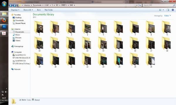
So it's been a week now since my last update now, so I've got a few things to show. Firstly to get all the research I was needing from BTTF I started to study the films in greater details. Watched through 3 times so far, once to look at possible avenues for merchandise, prop replicas and items that could be generally included in a set. Secondly to look at opportunities of how props could transpire over to packaging which sparked off some pretty interesting concepts. The final play through was the fun bit... 6 Hours of screen saving stills from the film, looking at key character poses and points within scenes. Through the images I was capturing I was hoping to obtain gestures and facial expressions that define each character and also looking into the background setting to aid the illustration of scenes. In total I managed to gather 593 images which I later categorised into folders so that the images were separated into scenes.

Photobucket

Also produced a binder to flick through below - Had to upload two seperate files because of 500 page limit:


From previous research into existing layout and formatting I'd decided on the 170x360 page setup and began to test and manipulate my layout. The binder below shows my initial concept that I've been working with these past 2 days. Unfortunately I haven't documented the experimentation that came to form this current setup but it was definitely not a short journey to get this far. What I'm trying to achieve with the layout is to manipulate its appearance in accordance with how the scenes are playing out. In some of the scenes that are slower paced and more about character building, we get a simple legible layout. However in more action based scenes the layout gets more aggressive accordingly. I'll also be aiming to test changing the background colour in these night scenes to add variation to the book but also to make it clear that the pace and style of the layout will be about to change.

Anyway.. Layout bind of the very early concept for the art section only. Be pushing this around some of the film and BTTF forums for feedback.


Hmm.. Just looking at it now even I'm seeing issues I didnt see an hour ago. I really like the layout right up to the point where we reach twin pines mall. It gets too cluttered and the spread as a whole brings down the whole thing at this point. Spread after that is effective, I like that one, still think the blacks working well to contrast and show that shift in story I was talking about. Time travel image after that spread on white looks to be working. I chose to go back to white at this point since the scene itself is so bright, I think it reinforces the brightness of the time machines journey. Flow on the page after that lets it down again and the spread after that with the more distorted layout would probably work better on black. No issues with final page. Will have to come back to this tomorrow morning and hopefully resolve the above.

COMIC BOOK CHOSEN FORMAT

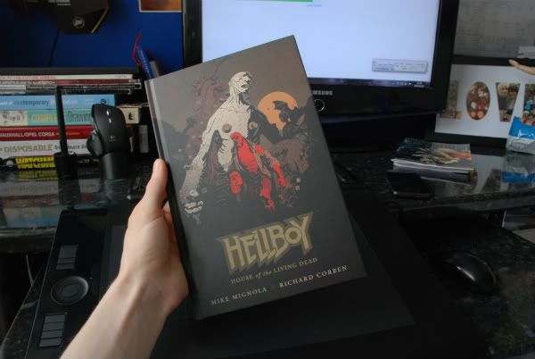
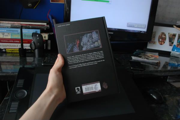
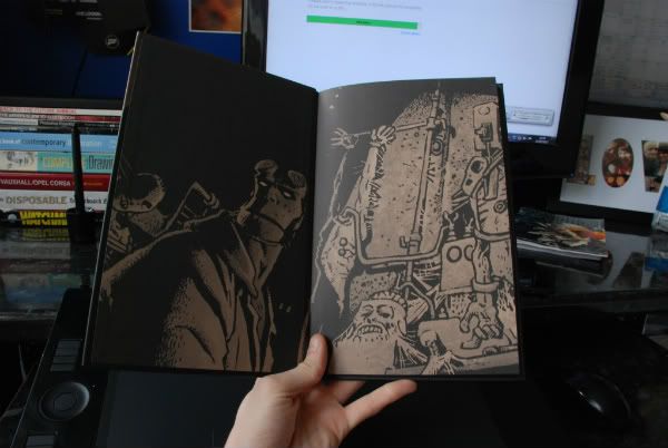
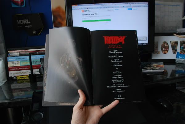
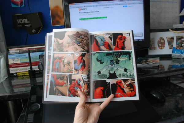
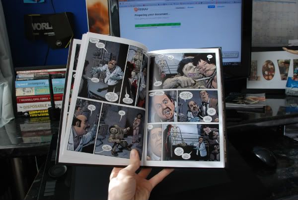
So today I made some pretty important decisions on the format. Throughout all these posts I've been looking at format of the books I've bought and the style of format from my scans. Whilst sourcing these books I came across a particular book that caught my eye. It's nothing overly special, it's just a hardback edition of a HellBoy comic but it's made by Dark Horse Books. Had a look a lot of their hardbacks and they're all uniformly printed to this really cool matt finish. I'm aiming to professionally print my art book so I'll have to get some discussion with a printing firm to closely match the material as it's what really makes the finish.

As you turn the page you see a matt sheet which is rough in comparison to the cover and printed on a much lower quality stock but still looks the part. Further into the book the pages are semi-gloss which is proving great contrast and really holding those blacks and dark shades well.


Photobucket


Photobucket


Photobucket


Photobucket


Photobucket


Photobucket


Saturday, 11 February 2012

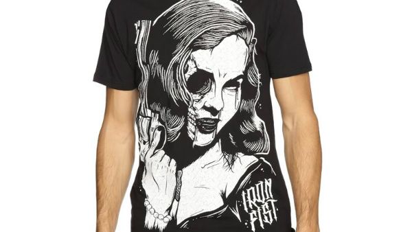
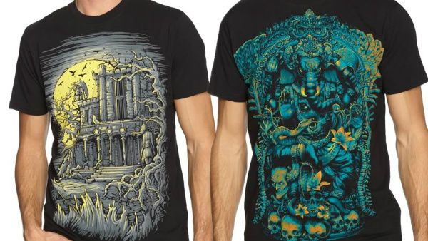
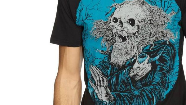
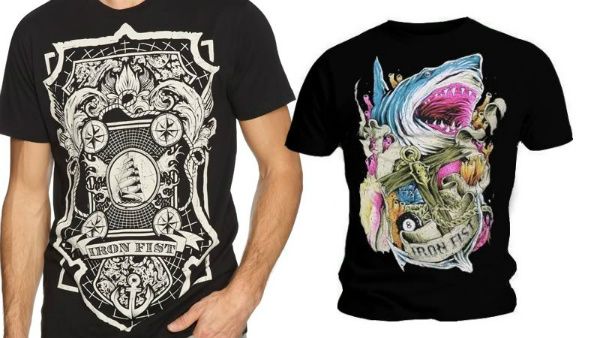
Iron Fist - Clothing Brand - Image Research

Iron Fist is a clothing company which I'm including some examples of here because the stlyle of artwork is quite relevant to what I'm looking at.

Photobucket
Liking this image, same kind of style to the wood/lino cuts I was looking at. Real old school design. Not enough to work alone on a album cover is this style however. Would need to be worked in with some more similar styles to make a more rounded piece of album art.

Photobucket


Photobucket

Photobucket

SE Cases

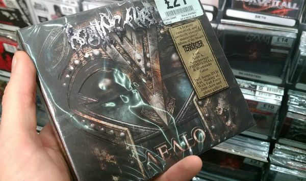
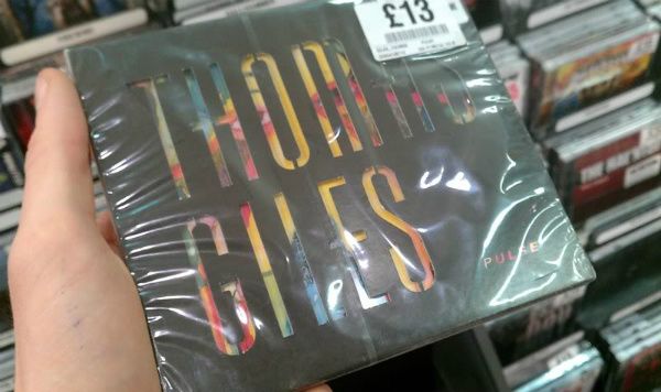
Today I had another look around the shops to get some images and see what others are currently doing. Lot's of varied results which was interesting to see as it started to give off lots of ideas for various things I could work with.


Main Points of Interest for further development:

Cut out sections I'm wanting to include
Photobucket

Photobucket

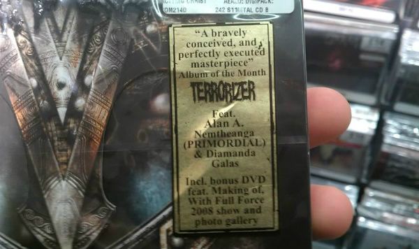
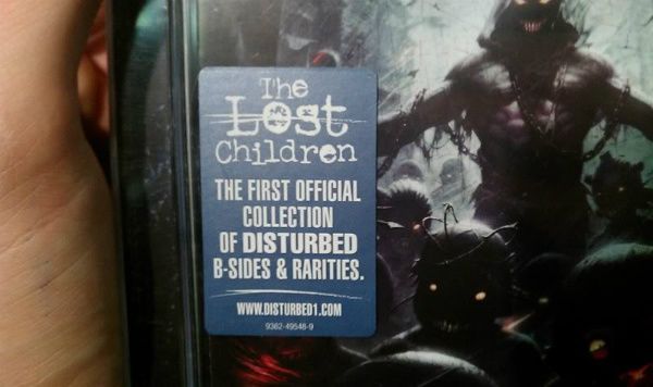
Labels
Photobucket
Possible copy - Includes new track Nightmare plus bonus DVD

Photobucket

Case Designs / Packaging Research

Today I've been looking at some existing cases and the ways in which they package their CD's.

I've ordered the photographs into a simple to complicated system. The covers that are appealing to me the most are the larger, more compelx designs. The problem with this is that we're currently designing for one CD so finding a reason to spread the case over this size may be difficult. However I will need a section to hold my insert containing the lyrics and band biography. Pictures binded below;

Friday, 10 February 2012

Big Book of Nets

Catergories and Concepts of the Art Book

So far I've looked at a lot of art books and I've seen what I do and don't like. I've also looked into numerous comics in a number of styles to get a better feel of how original artwork is applied throughout a comic series and how that can also relate to art books as well. So at this stage what I'm aiming to do here is really set down some categories and even rules to what my art book will include and how it will be presented.

Firstly I want the introductory chapter to give a quick glimpse into the film from the director’s point of view. The information for this can be sourced online and from one of the many editions of the BTTF series I already own. I also want to give this introductory chapter in a few European languages as was seen in the Dues Ex edition. Collectors’ items spread worldwide and I think its a nice touch to show relevance to other languages other than British at this stage. This will not however be something that will be carried throughout the entire book as this is unrealistic. I just think for an introduction it would be nice to see.

The theme with most art books is that they are mainly driven by concept art and the production of the film. This isn't something that will be included in my edition, mainly down to the fact that we wont be documenting other artists work, I'll be developing my own art style to drive the content. The style of art will be aimed as large scale imagery that tells the story of the film through detailed art pieces. These may cross over to double page spreads or just single page. Format will dictate this area, which I'll look into great detail as soon as possible. Following the introductory chapter the content will be image driven, depicting key elements that occur throughout each BTTF film. The concept is to create imagery that is full of life and effective at telling a story purely through image.

Following pages will go through single illustrations of each character alongside relevant information to be sourced at a later date. Also to be included will be the first original script which can be found online. The movie went through several drafts of this script and although it can be easily sourced online, an original feature such as this in a bound book would be a very nice collector item.

Ideally I'd like the content to run as follows:

Introductory imagery and contents page.

Introduction to the film - How the story came about, difficulties with shooting and production/general stories etc. Casting and issues with recasting Marty’s character for instance. All the little tales and facts a fan would like and even expect to see.

Lead into the art style based story.

Character pages and information sections which would be there to show costume design and characteristics of each member of the cast.

Script which would be featured against images from the movie to avoid large sections of overwhelming text.

The above is just a set of initial ideas for now. Once all concepts are in place I will begin to conduct formal questionnaire and actively seek advice from a forum I've just signed up to BTTF.com. This will help add a little relevance and reinforce the idea that I'm creating a true collector item and not something that just appeals to me. We're a long way of this point yet however so stay tuned!
Watchmen - Posters

Photobucket

Photobucket

Photobucket

Photobucket

Photobucket

Photobucket

Photobucket

Photobucket

Photobucket

Photobucket

Photobucket

Photobucket

Photobucket

Photobucket

Photobucket