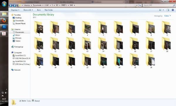
Also produced a binder to flick through below - Had to upload two seperate files because of 500 page limit:
From previous research into existing layout and formatting I'd decided on the 170x360 page setup and began to test and manipulate my layout. The binder below shows my initial concept that I've been working with these past 2 days. Unfortunately I haven't documented the experimentation that came to form this current setup but it was definitely not a short journey to get this far. What I'm trying to achieve with the layout is to manipulate its appearance in accordance with how the scenes are playing out. In some of the scenes that are slower paced and more about character building, we get a simple legible layout. However in more action based scenes the layout gets more aggressive accordingly. I'll also be aiming to test changing the background colour in these night scenes to add variation to the book but also to make it clear that the pace and style of the layout will be about to change.
Anyway.. Layout bind of the very early concept for the art section only. Be pushing this around some of the film and BTTF forums for feedback.
Hmm.. Just looking at it now even I'm seeing issues I didnt see an hour ago. I really like the layout right up to the point where we reach twin pines mall. It gets too cluttered and the spread as a whole brings down the whole thing at this point. Spread after that is effective, I like that one, still think the blacks working well to contrast and show that shift in story I was talking about. Time travel image after that spread on white looks to be working. I chose to go back to white at this point since the scene itself is so bright, I think it reinforces the brightness of the time machines journey. Flow on the page after that lets it down again and the spread after that with the more distorted layout would probably work better on black. No issues with final page. Will have to come back to this tomorrow morning and hopefully resolve the above.

No comments:
Post a Comment